 CRM Options: Deal Dash
The purpose of Deal’s in iPoint is to help track the sales pipeline for your company.
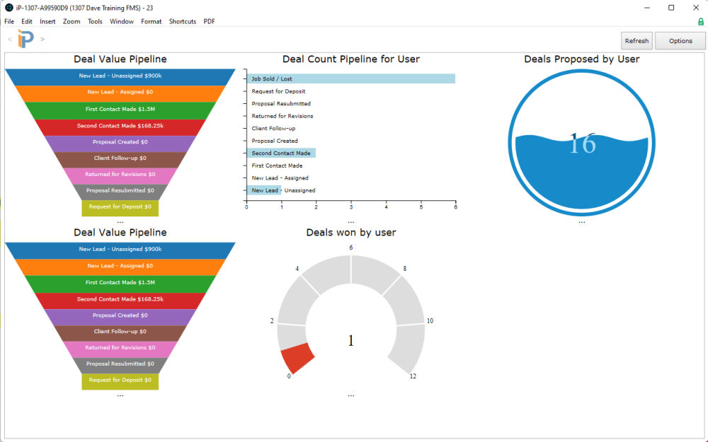
Click on the CRM module and choose the Deal Dash option to access the pipeline reports. This button opens a new window that can display several graphical charts showing all the deals in iPoint.
Remember that the Deal Dashboard might have a different name if your system administrator has given Deals another term in the Settings module.
.
.
.
.
.
.
.
.
.
.
Deal Dashboard
The charts on the dashboard are user-specific. So each of your users can customize their dashboard to the information they want to see.
- The Refresh button runs a check through iPoint data and updates the graphs with the most current data.
- Options button allows users to customize their reports.
- Initially, the Deal Dashboard is blank, and users will need to create the graphs and information of interest.
- The dashboard can include up to six graphs. Each user can customize which graphs they would like displayed.
.
.
.
Chart Configuration
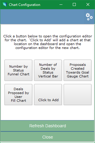
On the Deal Dashboard, click on the Options button in the top right corner to open the Chart Configuration window.
- Click on any of the six chart positions to add or modify a chart.
- Click the gears icon in the top right corner to
- Duplicate a chart. This button makes it easy to modify an existing chart to display slightly different information.
- Remove Chart to delete the selected chart.
- Remove All Charts to start with a blank dashboard.
- Close the Options pop-over.
Click the Refresh button to update the dashboard with the changes made on the Chart Configuration window.
Click the Close button to close the Chart Configuration window.
All graphs have six variables:
- Data To Use – use the dropdown to select a specific set of data elements to display.
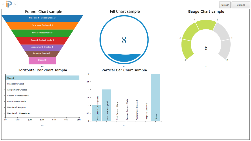
- Chart to Use – select the kind of chart to be displayed: Funnel Chart, Horizontal Bar, Vertical Bar, Fill Chart, or Gauge Chart. Not all chart types are available for every report.
- Target – the goal set by user or total for all users, depending on the report.
- Value – the actual data by user or total for all users, depending on the report.
- Bar charts have an X Axis and Y Axis value instead of target and value options.
- Title Label – a text field where you can customize the graph’s title.
- Footer – another text field where you can customize the text below the chart.
There are eight graphs to choose from:
- Deals Proposed by User towards Count Goal – compares the number of Deals with proposals against the user’s Deals Proposed Goal.
- Deals Proposed by User towards Value Goal – compares the value of Deals proposed against the user’s Deals Value Goal.
- Deals Won by User towards Count Goal – compares the number of Deals won against the user’s Deals Won Goal.
- Deals Won by User towards Value Goal – compares the value of Deals won against the user’s Deals Value Goal.
- Pipeline – All Deals Count – charts the number of all Deals in their various stages from all users.
- Pipeline – All Deals Value – charts the value of all Deals in their different stages from all users.
- Pipeline – Deal Count for User -charts the number of Deals for the individual user in various stages.
- Pipeline – Deal Value for User – charts the value of Deals for the particular user in their different stages.
Chart Samples
Here is a sample of each of the chart types available.


